
Project Overview
Urban Yoga Spa is not your typical yoga studio. They have a chic, urban loft vibe and cater to people who live downtown, work downtown, or are travelling. As their owner told us, their typical member is a “type A, want a butt kicking workout, dedicated yogi.” They also offer yoga classes, luxury spa treatments, athletic retail, event space, and a gourmet coffee shop.
Business Goals
Urban Yoga Spa came to us to refresh their website and work on the following:
- Make it more dynamic, impactful, and exciting
- Get rid of old content
- Bring more awareness to the spa and coffee shop
- Sell more memberships and services
Given our time frame of a little over two weeks, we worked with Urban Yoga Spa to narrow the scope of the project to:
- Reorganize the site structure
- Examine and rework the flow of the yoga portion of the site
- Update the visual design
My Role
Interaction Designer
Team
Monique Boediono, Information Architect and Visual Designer
Jack Chory, User Research
Duration
2.5 weeks
Tools
Omnigraffle, Sketch, Photoshop, InVision, Jakob Nielsen’s Usability Heuristics
The Problem
The Urban Yoga Spa website had grown in an unruly way. It was difficult to find important information, it was confusing, and users were not able to get a good sense of what the studios and spa were like. There was content that was outdated, a blog that was not kept up, inconsistent branding, and confusing processes for making spa appointments.
The Solution
We designed a more streamlined site that helps new and existing customers find the information they need and get a sense of Urban Yoga Spa and all they have to offer.
Research
I assisted Jack, the researcher, by conducting a Competitive Analysis and an Heuristic Evaluation.
Heuristic Evaluation:
To gain more insight into the state of the current website, I performed a heuristics evaluation. I used Nielsen's Usability Heuristics to evaluate what was working well and what was not.
Results:
Inconsistent process and experience
- Purchase flow feels very different than the appointment making flow
- Jarring disconnect when purchasing
Schedule issues
- Key information was missing in the pop-ups for instructors and class descriptions
- No filtering - much scrolling required
- Calendar on upcoming workshops and events page confusing and probably unnecessary
Buying classes and memberships
- Inconsistent buy now options are confusing
- Options on purchase site are not explained on main site, ie: donation class
- Information buried below class descriptions
Competitive Analysis:
After looking closely at Urban Yoga Spa's site, I examined other fitness and spa sites with a user flow in mind: a new client looking for general information about the studio/gym and specific information about schedule, classes, instructors and membership costs.
Takeaways:
- Easier to get a sense of a gym/studio when there are lots of pictures and an about us or “what to expect” page
- Sites that separated costs from class information were clearer and easier to navigate
- Schedules that allowed filtering were more efficient and easier to use
Now that we were more familiar with the Yoga/Spa space, we moved on to finding out what the typical yogi and spa goer wants and needs from a site.
Usability Testing and Interviews
Jack tested the current site with 5 people and did 8 interviews to get a sense of pain points, user needs and goals.

Results
We used an affinity diagram to tease out the most important themes from the data gathered in interviews and user testing of the current site.
We used all of the research information to help set our goals for the redesign keeping our target users in mind.
Persona
Jack took the information from the research and built a Persona out of it to help us focus our design on the needs and goals of the people we were designing for, not what we thought or assumed their needs and goals might be.
Goals
Make it easy for potential and existing clients to:
- Easily access key information: class schedules, pricing, class descriptions, information about instructors
- Get a sense of UYS and what to expect there
- Buy class passes and memberships
Design
Information Architecture
One of the main issues with the current site was that it was difficult to find information, both about Urban Yoga Spa in general and about important details like pricing. Monique built a site map that did an amazing job of restructuring the site and organizing the information in a logical, clear way.
User Flow
To help determine the best way to design a UI that would help potential and existing clients get the information they need from the site, I mapped a user flow for the main goal of getting information about types of classes, instructors and schedule.
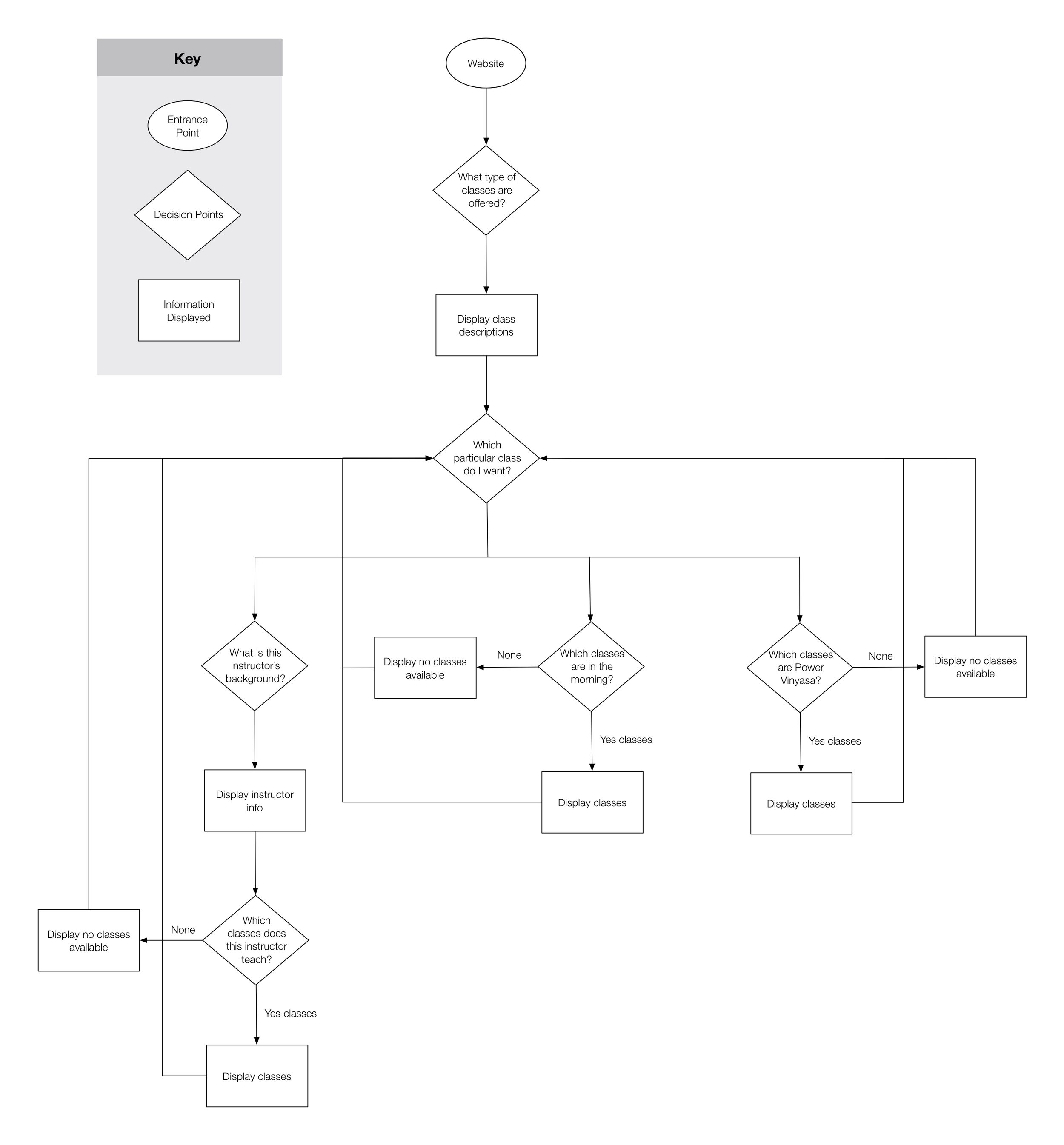
User Flow For Finding Class: Instructor, Time of Day, Class Type

Design Studio
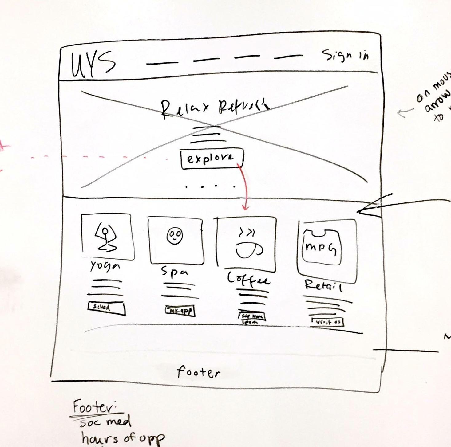
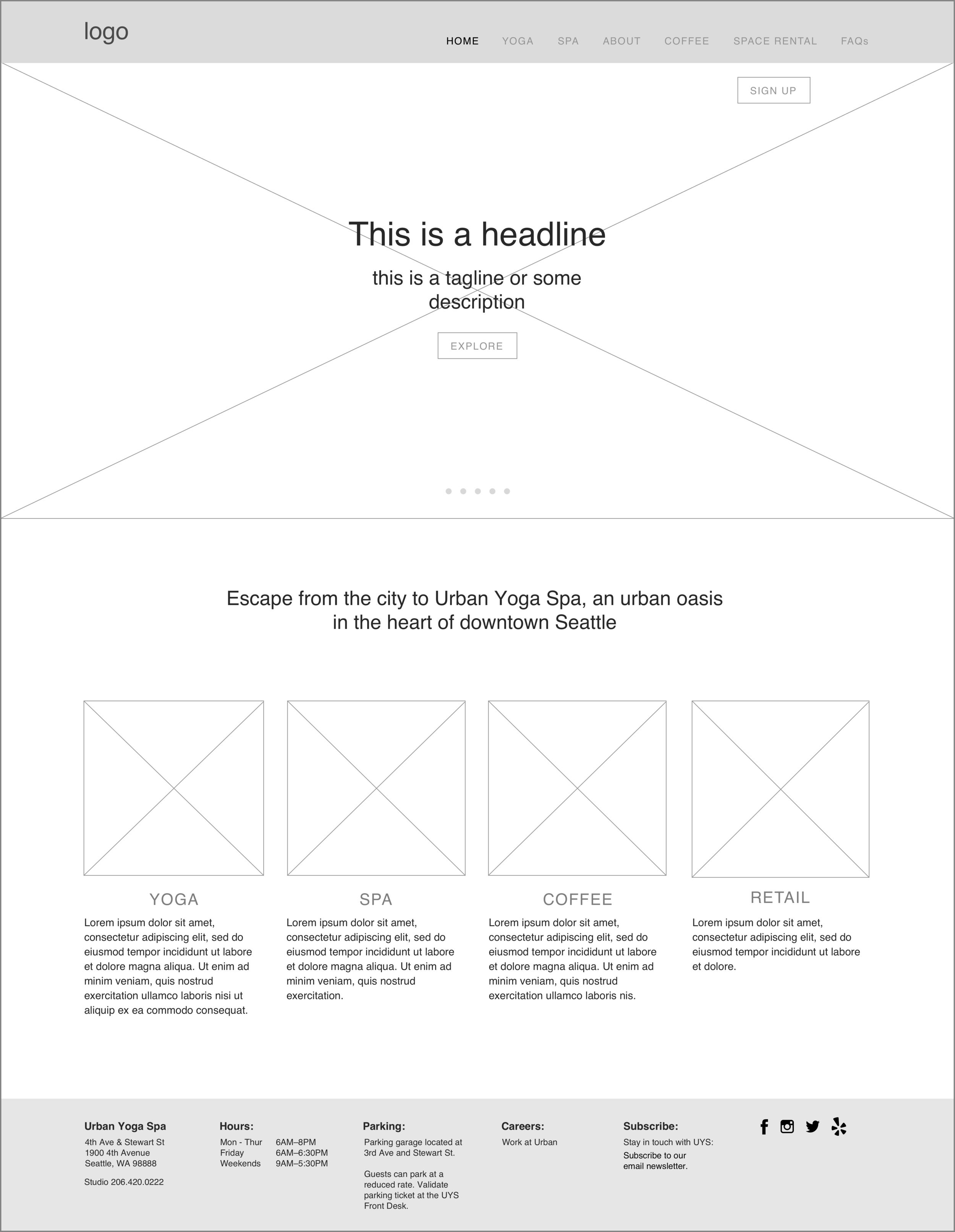
To kick off the design process, I led a design studio. We focused on the home page with the scenario of a new potential customer coming to the site trying to get a sense of Urban Yoga Spa.
Our goals were
- Give a sense of Urban Yoga Spa and what to expect
- Build awareness of the spa
- Simplify the content
To meet these goals we focused on
- Strong photos to tell the story of Urban Yoga Spa
- Less and more cohesive content
- Information about the spa, coffee shop and retail
- An “explore” call to action button
Sign up button
When we visited UYS we learned that first time clients sign up on iPads at the front desk. The link to sign up was a drop down from the main navigation of the site, and was very small and hard to use on the iPad. To solve this problem, we made a larger “sign up” button on the upper right corner of the home page, easily accessible and tappable.
We worked hard to come to a final solution we were all happy with. This was a great start and now I was ready to jump into designing the interface for more of the site.
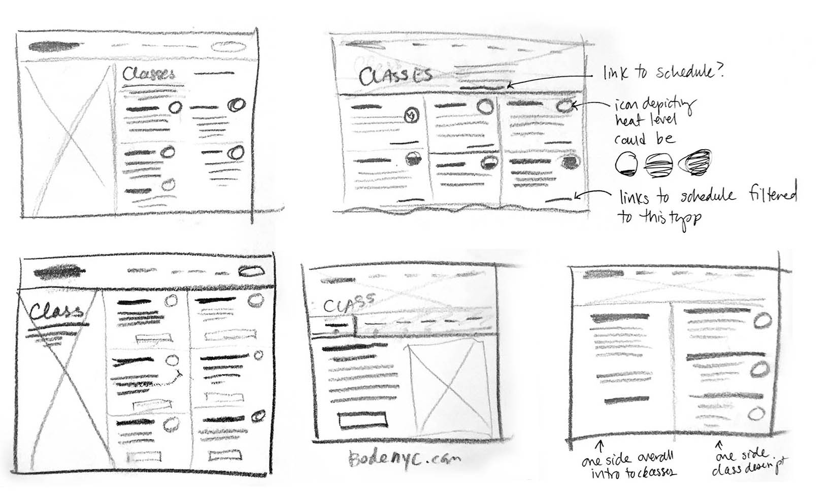
Sketching
The key flow we focused on for design was someone coming to the site to get a general sense of Urban Yoga Spa and then specific information about yoga. Keeping this flow in mind, I sketched out screens by hand and then refined them into higher fidelity wireframes in Sketch.
Wireframes
Click on the images to view as a slideshow:


Navigation
Because people were having a hard time locating information on the original site, I decided to include a secondary navigation bar that remained visible in the sections of the site that had a deeper structure. That way when a user is on the classes page, she can easily see how to get to pricing information without having to move her curser up to the main navigation to get the dropdowns like in the original navigation.

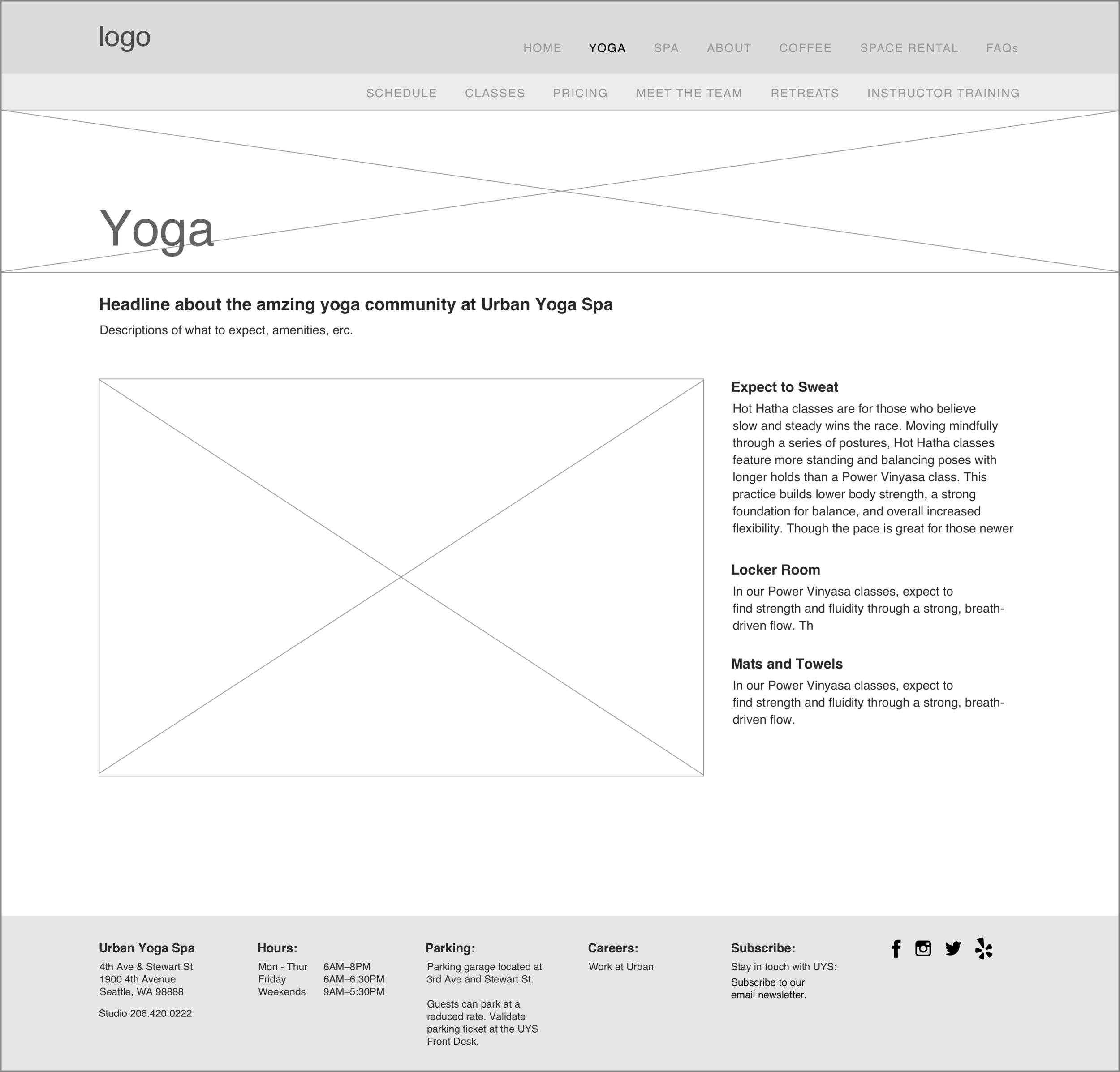
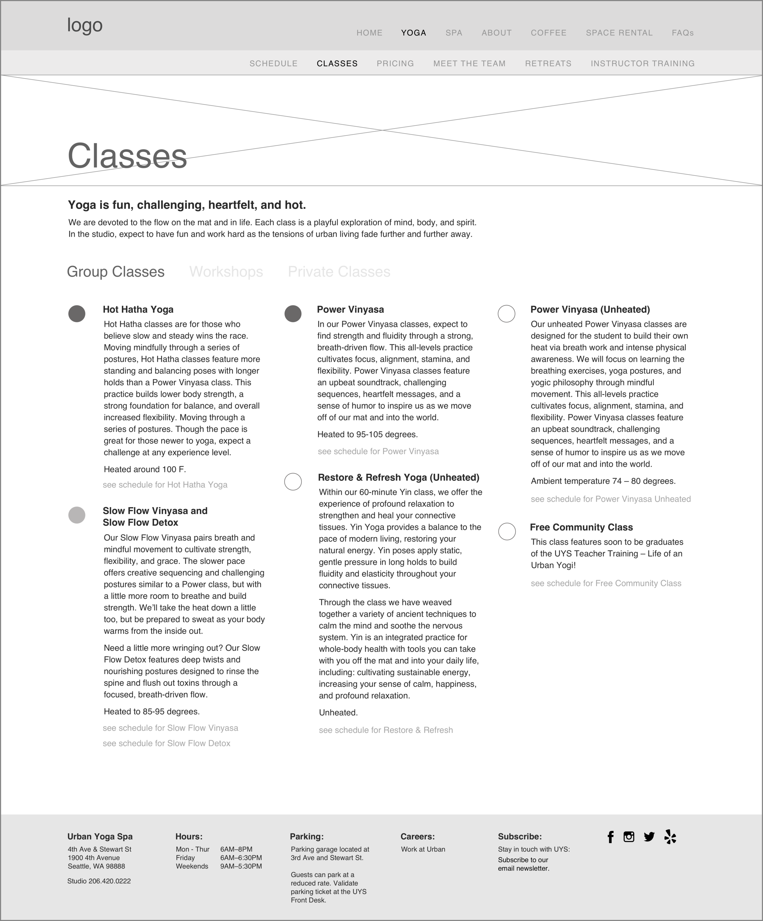
Classes
In discussions with the client we found that not knowing which classes were hot yoga and not was a pain point for members. To help with this, I decided to add an icon to indicate class heat level on the description page and put a temporary placeholder for this on the wireframes.
I added tabs for group classes, Workshops and Private classes to make workshops and private classes easier to access but also visible for visitors to the page who might not know about them otherwise.
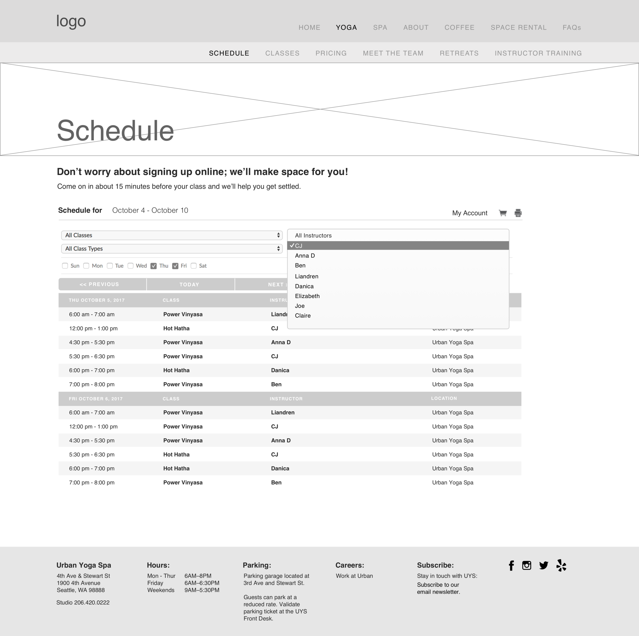
Schedule
Urban Yoga Spa was using software called MindBody for scheduling. After a discussion with the client, I did more in depth research into other options for scheduling and compiled some potential types they could implement in future iterations.
For this project I stayed with MindBody framework. To make it a better experience for users, I added filtering by day of the week, time of day, instructor, class type and studio so people could find a class without having to scroll through so many options as the on the current site.
Usability Testing
Interactive Prototype
I built an interactive prototype in InVision out of the wireframes which we used for usability testing with 8 participants to see what was working and not.
Testing Results and Iterations
The testing went very smoothly and participants were able to find all of the information they were asked to and with a lot fewer clicks than when they were testing on the existing site. There were, however, some areas for improvement:
Call to action
Some testing participants wanted to see a way to buy classes or membership in more places.
- Added a JOIN button to the secondary navigation
Pictures
Participants also wanted to see more pictures.
- Added larger pictures to the bottom of the home page
- Added more pictures to the Yoga and About Us pages
Heat icons
The placeholder icons for class heat level were confusing.
- Refined icons and added heat level of the classes to the title at the top
More Iterations
After showing our client the first round of wireframes, we had a few more iterations.
- Added a banner below the rotating hero image where owner could advertise specials
- Added a Facebook widget to the About Us page
We also decided on a few more changes:
- Adding call to action buttons in the lower part of the homepage that are relevant to the sections (yoga, spa, coffee, retail.)
- Moving the sign up button from the home page into the main navigation so it is accessible from everywhere.

Visual Design by Monique Boediono
Next Steps
Schedule
- Populate instructor and class information in popups consistently
- I did a more detailed competitive analysis looking at scheduling tools and gave recommendations of some to the client to look into.
Instructor bios
In our research we found that people were looking for more specific credentials and other information that are not included currently.
Spa
There is a lot to explore and improve in the spa part of the site.
- A quick fix that would make a huge difference is to edit the choices in the dropdown for choosing a therapist; currently it includes all instructors and very few of them can actually be scheduled.
- Making an appointment has a very different look and feel to than purchase; it would be helpful to make these more consistent.
- Change the email confirmation message from: “Your appointment request has been successfully submitted and awaits approval" to something more friendly and welcoming.
Summary
Overall, the project was a success and I am excited to see the changes implemented. I would love to be able to continue to redesign the parts of the site that were not part of our scope due to time constraints.
Challenges
The client was supposed to provide us with a list of potential research participants but were not able to follow through. Jack was able to recruit some good candidates, but it pushed the schedule back.
What went well
There was a lot that went smoothly:
- the team worked really well together
- the client was appreciative of the work
- we were able to visit the space and get a real sense of what they are all about
What I learned
The project was very quick and we did not check in with the client as much as we should have, which was my responsibility. We could have saved some time if we had shown him the wireframes and gotten his feedback about additions to the web page earlier. Next time I would also push harder to get the client to be involved with the Design Studio.
Measuring Success
The client's business goals were to increase sales - both membership sales and spa appointments. Before implementing changes, we would gather data about current sales and compare it to sales after the new website is live. We would also look at web analytics to see how usage of different parts of the site changes.