project overview
Meori is a company based in Germany that sells foldable storage boxes. The company is fairly new to the American market and was getting ready to ramp up marketing efforts to increase online sales. They came to me to help shore up their website.
Business Goals
Meori's US operation would eventually like to update the entire American website to be more in line with US consumers’ expectations, but for this project, we focused on the purchase path of the site, with the goal of being able to convert visitors to buyers and to make interacting with the site a more enjoyable experience.
The Marketing and Operations Managers had concerns about online purchases. They knew this part of the site did not seem to flow well and felt outdated, but they were not sure why and wanted help figuring out how to improve it.
My Role
UX Designer
I collaborated with the operations and marketing managers as well as engineering.
Tools
Illustrator, Photoshop, Sketch
Duration
3 weeks
Research
Usability Testing
I tested the current site to find out what pain points shoppers were experiencing when searching for and buying products. I had 8 test participants perform search and purchase tasks and analysed the results.

Findings
The testing identified a lot of areas that could use improvements. The main pain points for the participants were:
- confusing and limiting filter on the main shopping page
- not enough variety of product visible at the top of shop page
- countdown on the “continue” button confusing and distracting
- checkout process feels like a lot of steps
Design
User Flows
I used the results of the user testing to help me create user flows that addressed the areas where users were running into problems.
Wireframes and Prototypes
Using the user flows as a guide, I started sketching screens to play around with different approaches to solving the problems I had identified. I then built some low-fi wireframes for the main shopping and purchase pages in Sketch and used them to discuss with the operations manager what information to include where, and how to present the information in a clearer way to make the site easier to use for shoppers.
After a few iterations, we decided on a structure and I moved to making high fidelity wireframes for the operations manager to use in meetings with the German owners and discussions with the developers about what can and can’t be done at this time.

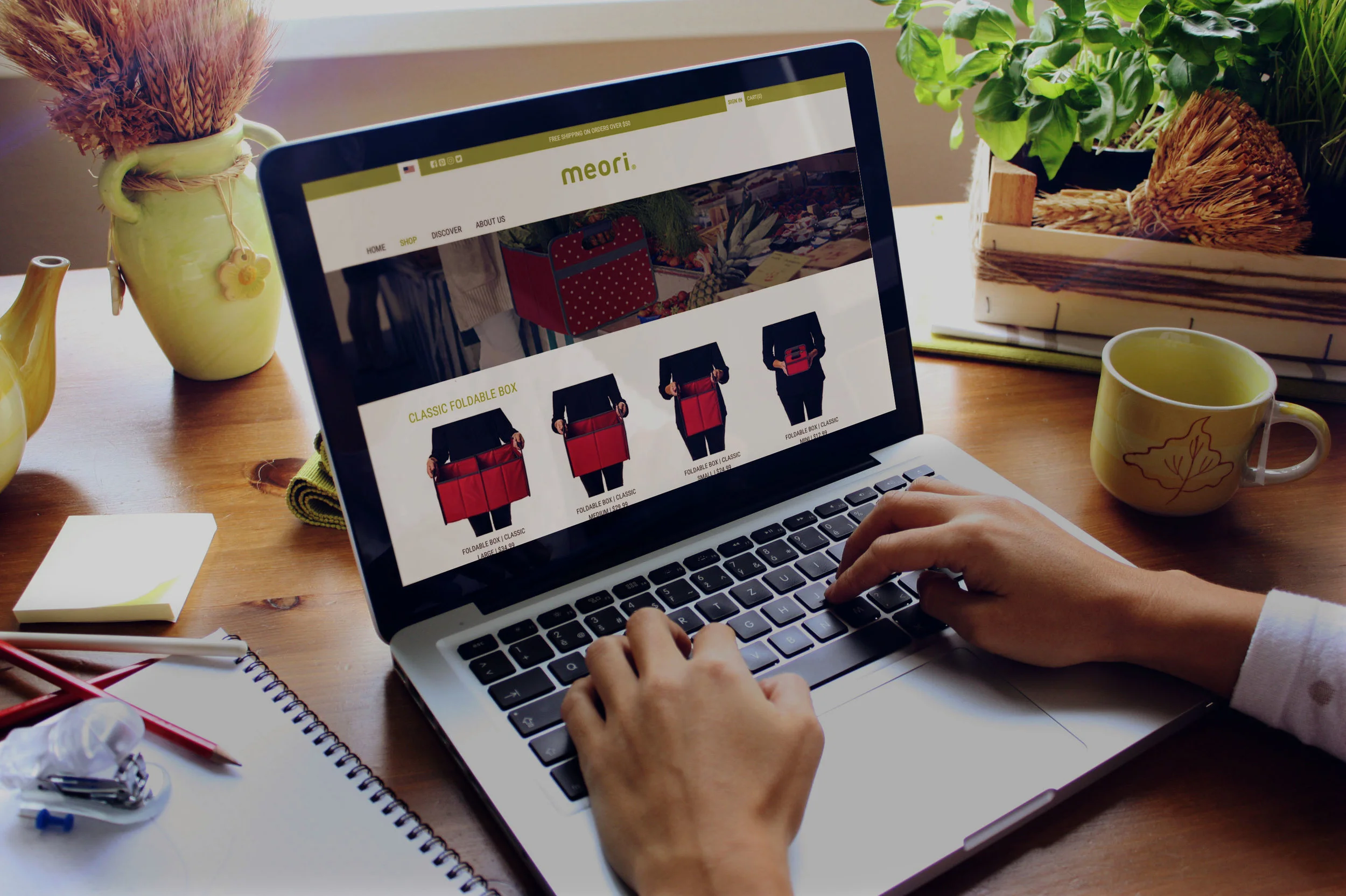
Main shop page before
Main Shopping Page
The two biggest issues users were having on the main shopping page were with the filtering system and not being able to see a variety of products Meori sells. There was not enough product to warrant a filtering system and the functionality ended up confusing shoppers and limiting their choices in unexpected ways.
Meori was using filtering as a way to showcase different uses and categories of products so I addessed this need by grouping products on the main shopping page by the main use categories and including all of the categories in a dropdown menu.
For the main shopping page I focused on:
- Showing more variety of product
- Demonstrating size and scale visually
- Removing the filtering
- Adding categories to navigation
Main shop page after
Cart before
Cart
The main issues with the cart were the use of space and the functionality on mobile.
The main changes I made were:
- Save the steps for Checkout to make fewer steps and consolidate space
- Changed quantity update to plus and minus to make it easier on mobile
- Moved "continue shopping" button to more expected location
- Reorganized space to make related products more visible
Cart afer
Checkout before
Checkout
The main issue test participants mentioned about the checkout process was that it felt too laborious, so I made these modifications:
- Condensed steps from 6 - 3 by adding a checkout method screen after the cart and consolidating payment information
- Moved the progression to the top and added an order summary in its place
Checkout after
Next Steps
The project is on hold at the moment while Meori decides if they are going to make the site a priority financially and, if so, how much redesigning and rebuilding they want to take on.
If they decide to move ahead with minor changes, I will make an interactive prototype and do some usability testing to make sure my designs are on the right track.
If they decide to do a larger redesign, I would start with usability testing more of the site than we did in this round of design so we could determine priorities. I would also redesign the site structure and navigation as many of the links to important contact are less visible because they are in the footer.
summary
I would love to be able to work with Meori on a more thorough redesign. There is a lot we could do both structurally and visually to improve the function of the site and help bring them success in the American market.
What went well
This project was rewarding to work on because there were some very clear improvements that could be made without a lot of time and expense. The marketing and operations managers were very supportive and appreciative and realized the value in redesigning the site.
Challenges
The biggest challenge was convincing the owners in Germany the importance of a redesign. The usability testing helped the marketing and operations managers to make their case for a larger site redesign, but it will be up to the owners to prioritize resources.
What I learned
I did not have contact with some of the main stakeholders in this project which was frustrating because I would have liked to understand their priorities and motivations better. Next time I would explain the importance of this at the beginning of the project and be more assertive in making sure I have contact with key stakeholders.
Measuring Success
Moving forward, I would get a baseline of conversion to purchase rates so we could compare the rates from before before and after changes are made. If we move forward with a more significant site redesign, we would have to determine the larger business goals to measure.